About
Creative chaos is expensive. Missed deadlines, inconsistent branding, overloaded teams, ad-hoc everything, it all has a cost. I got obsessed with fixing that a long time ago. I help creative teams work better, and connect what they do with what the business actually needs. I map the logic, find the friction, and build the systems that make everything flow. Not more people. Better processes. Because I've seen what teams are capable of when the noise stops.

Years of Experience

International Markets

Productivity Boost

Audience Growth
Project Name:
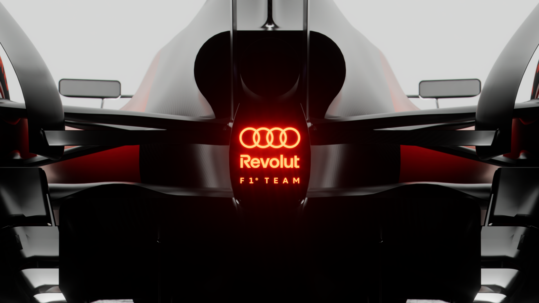
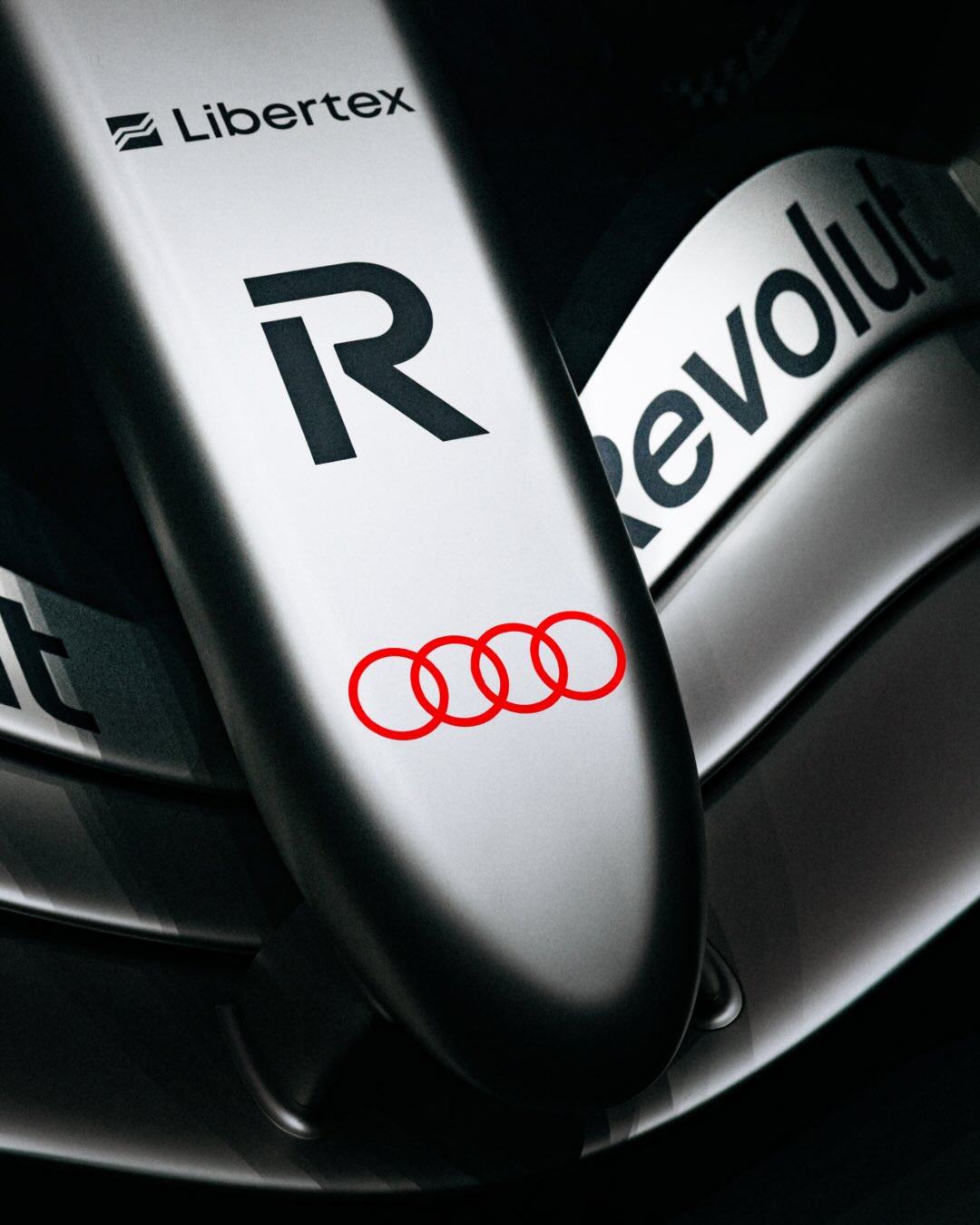
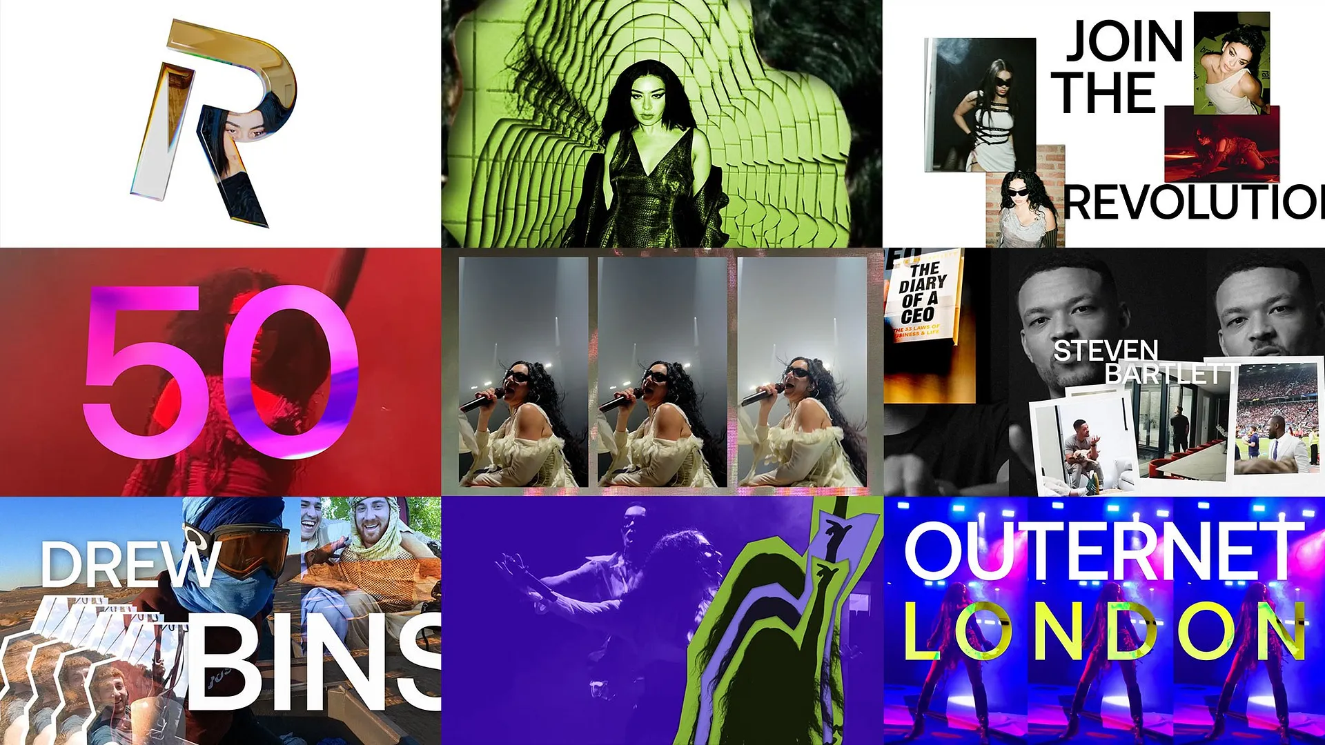
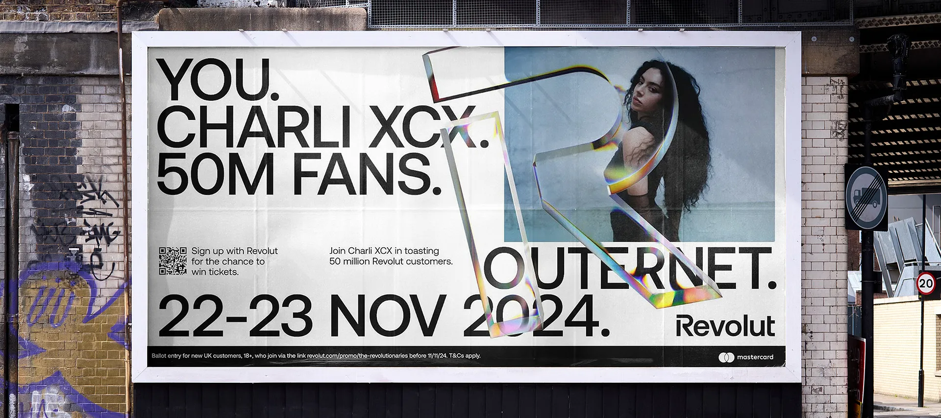
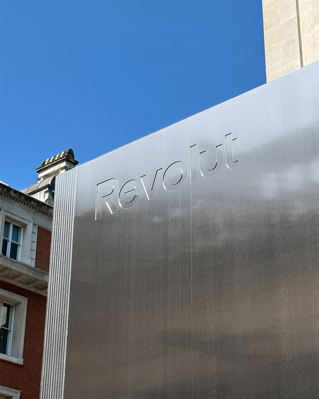
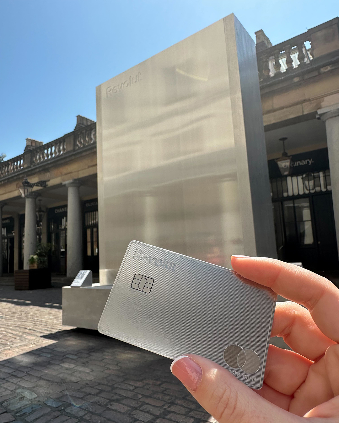
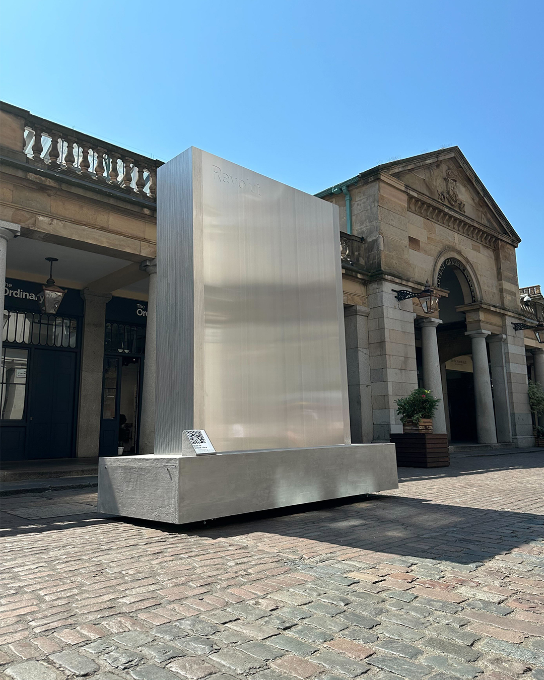
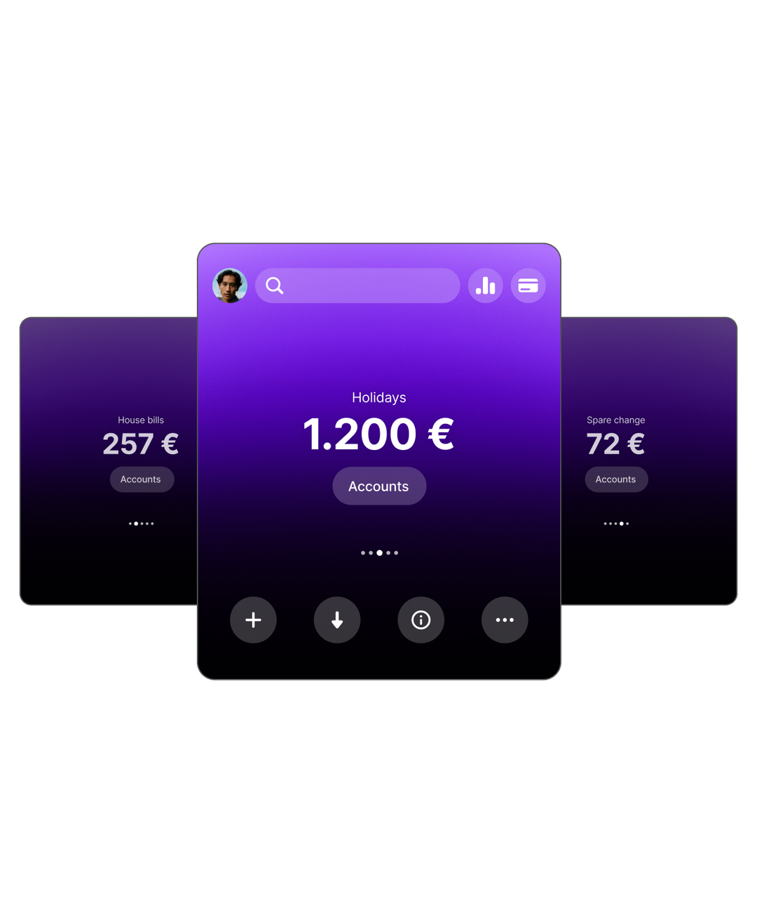
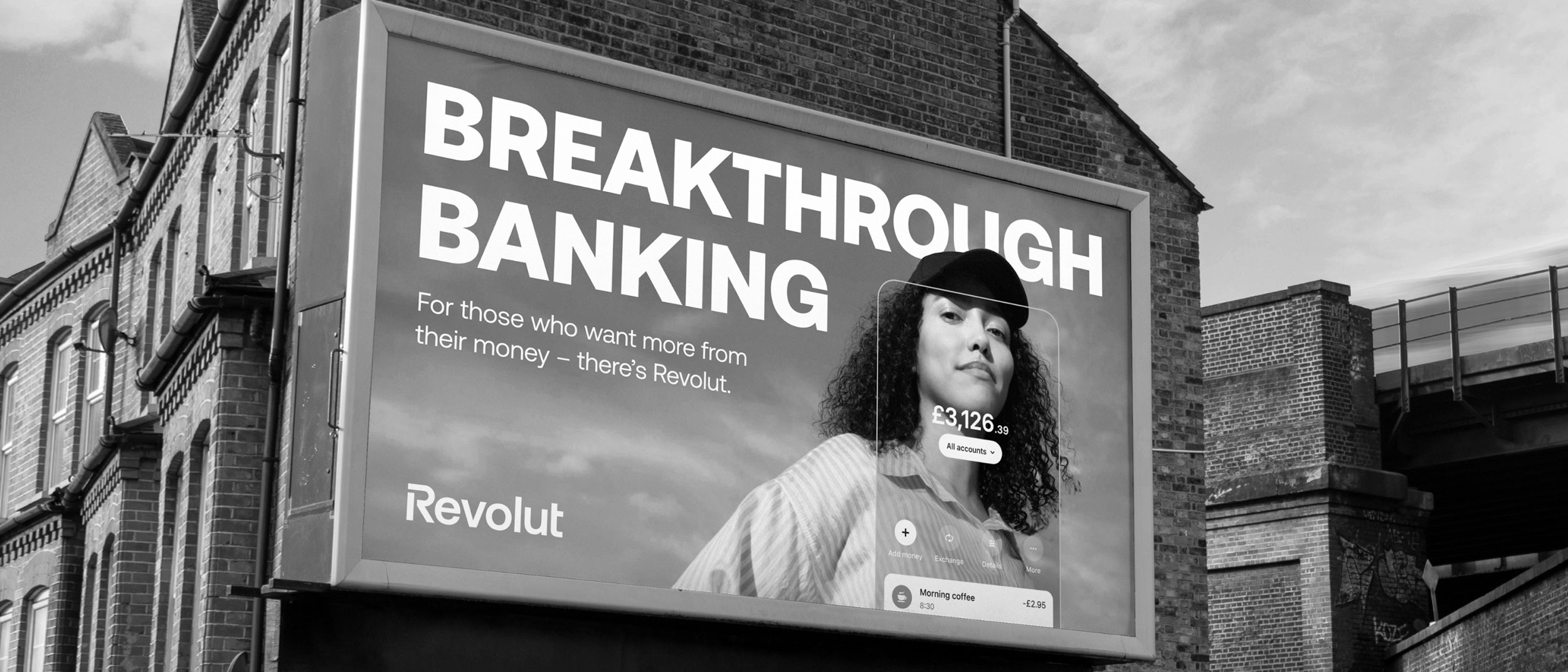
Revolut — Where process met creativity
Description
Scaling Hyper-Growth
Industry:
Brand Consistency - Creative Pipeline - Fintech

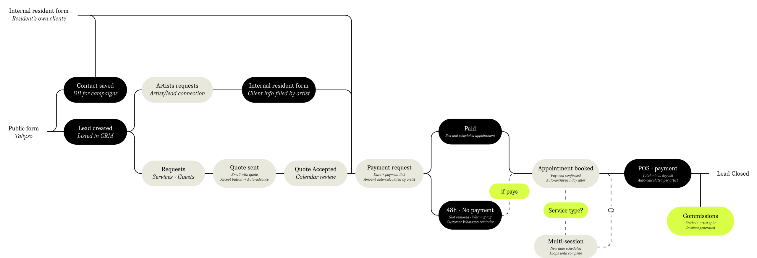
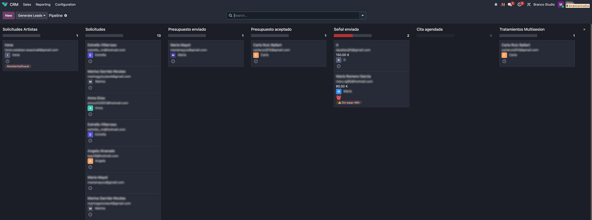
Project Name:
Vault — Where strategy meets creative ops
Description
Creative Infrastructure
Industry:
Brand Systems · Creative Direction · SaaS
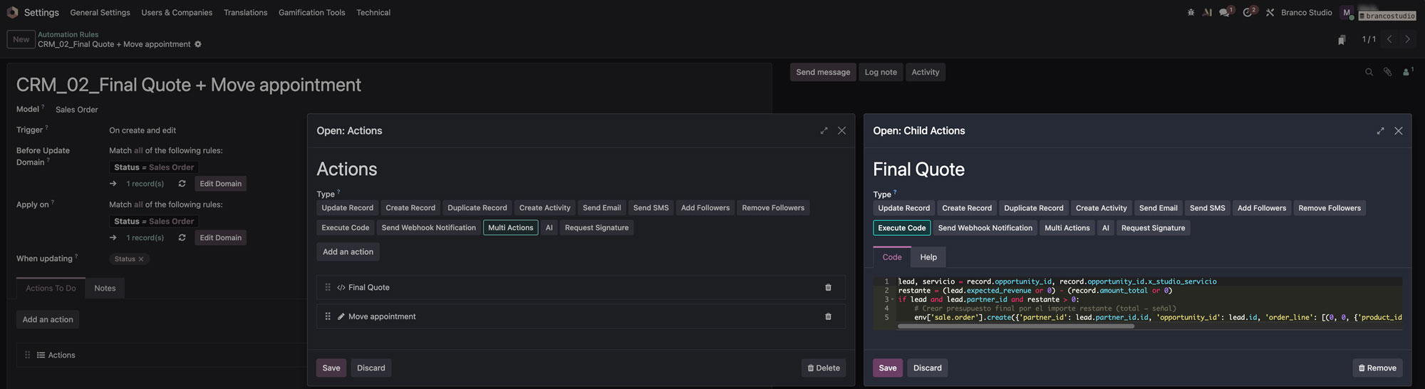
Description
Operations, built from zero
Industry:
Business OS · Automation · Odoo · Make