Anisette and Monne are two typefaces born from a graphic project focused on historical preservation.
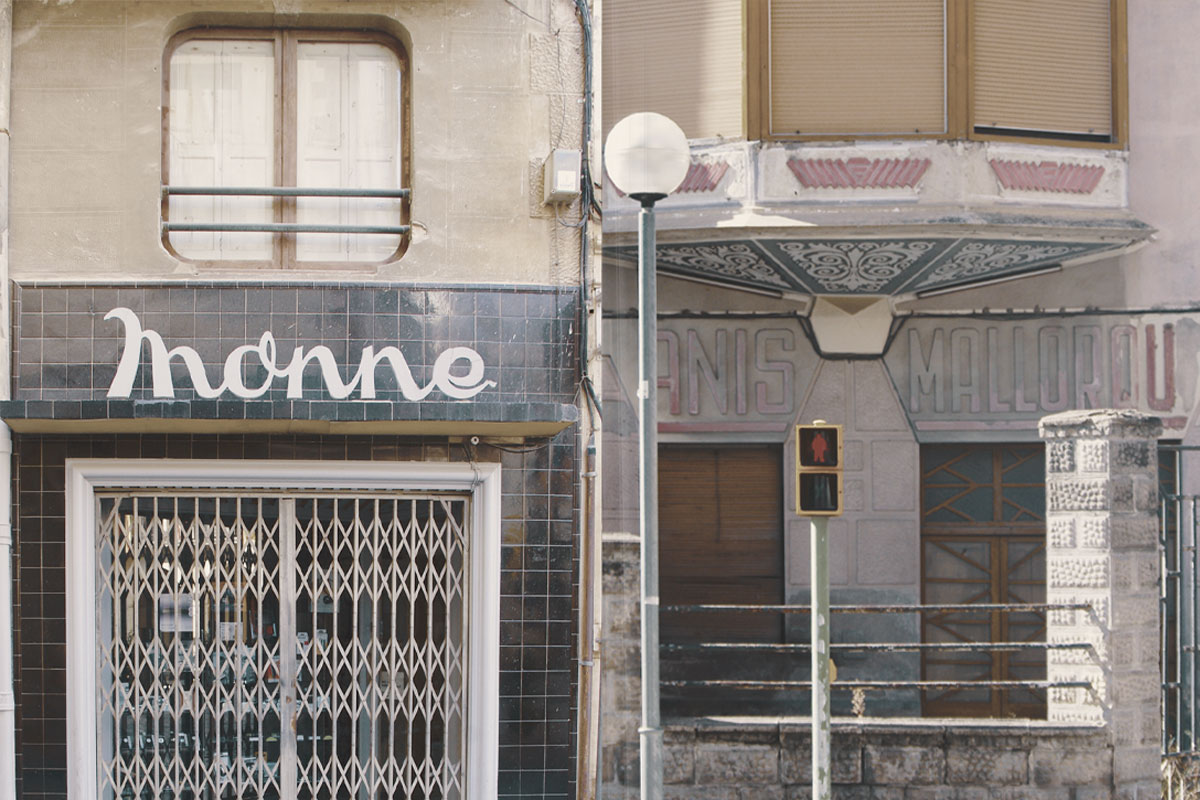
This work is based on the digital conversion of two signs located at the entrance of two companies. By creating the missing characters and adapting certain nuances, a complete typeface was developed.
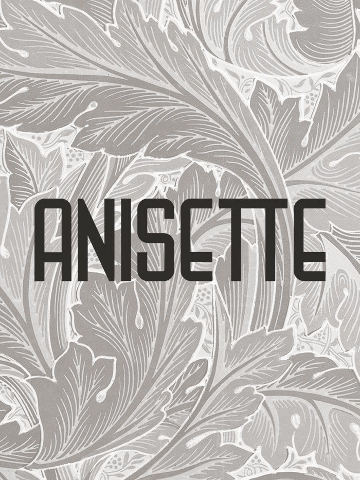
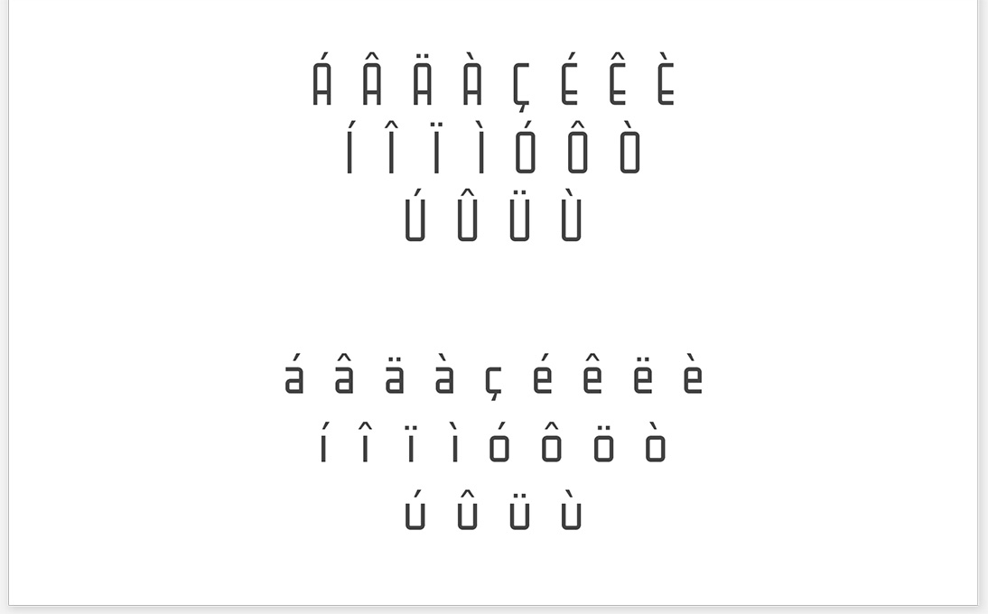
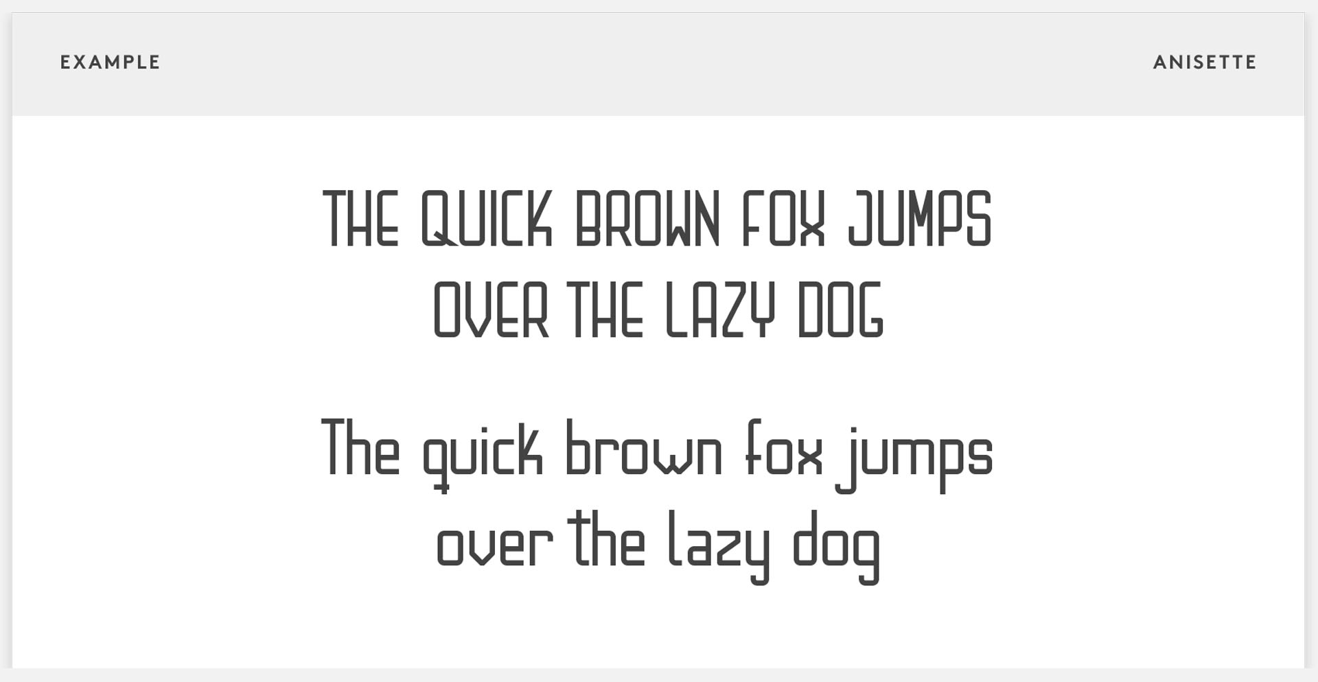
The name Anisette comes from an old distillery that used to produce anise-flavored liquor.
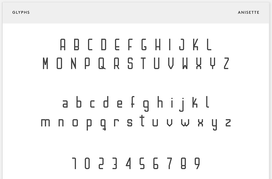
The resulting typeface is a sans-serif font consisting of six different weights. For its presentation, a collection of postcards was created, each featuring a letter of the alphabet. One part was detachable, showing a graphic design quote on the front and the alphabet on the back — all written in the Anisette typeface.
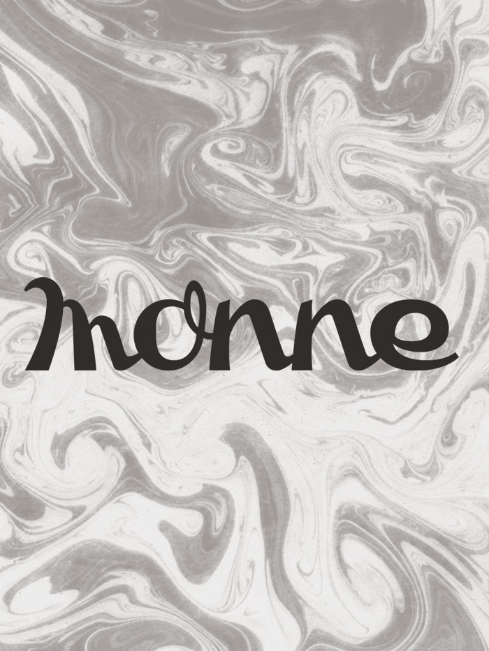
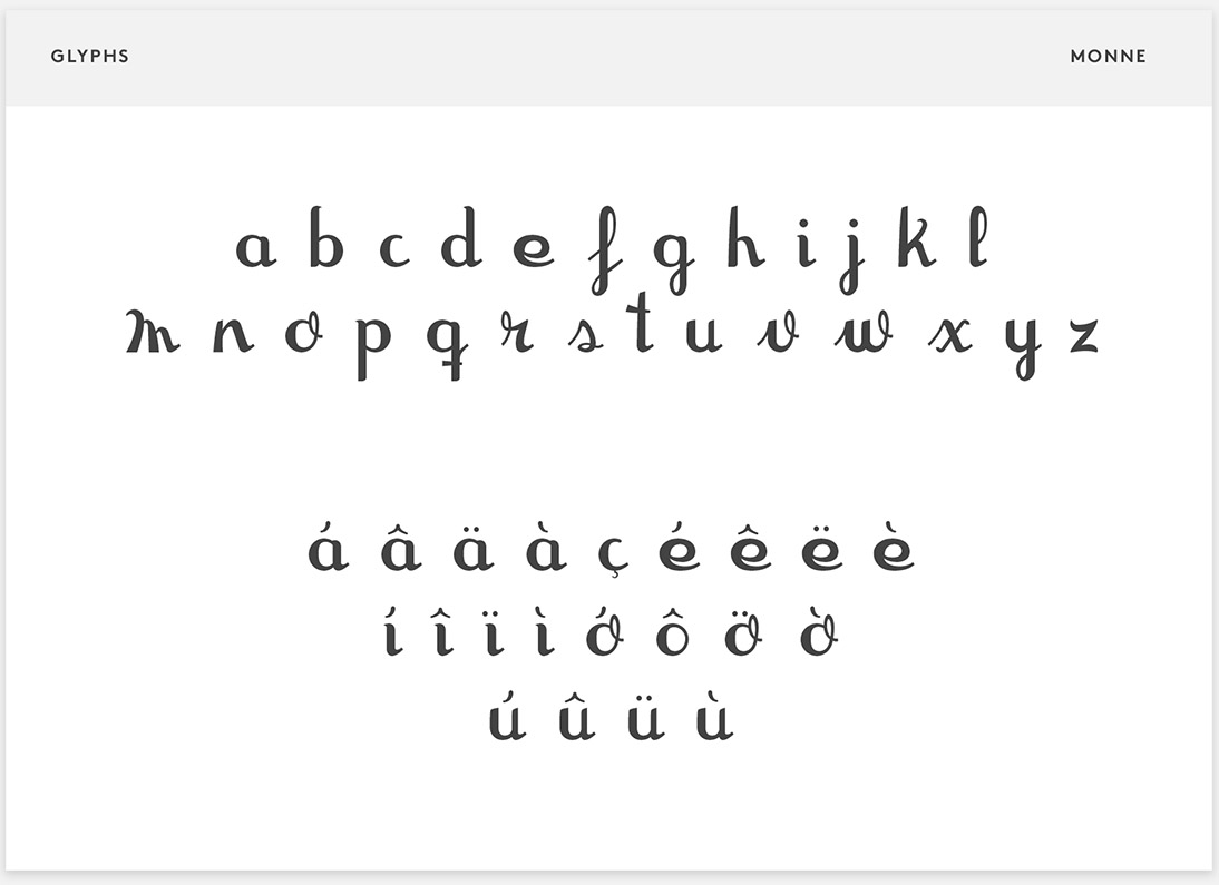
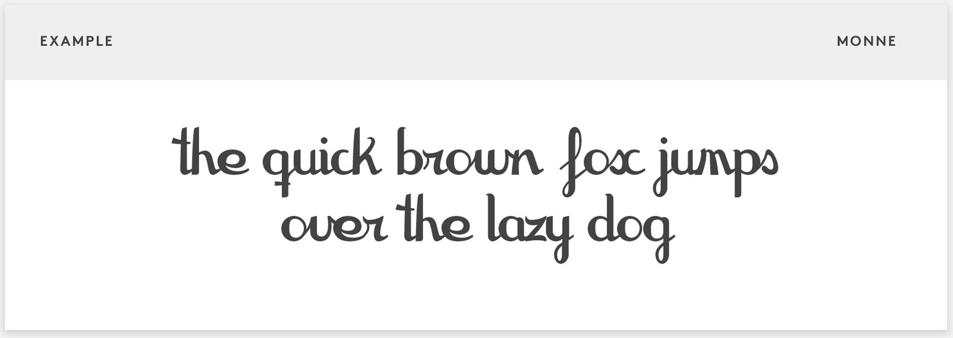
The name Monne comes from the surname of the store owner, which was part of the sign above their shop.
It is a gestural, calligraphic typeface composed exclusively of lowercase letters. For its presentation, a series of posters was created that showcased both the font in various styles and the complete alphabet.
Innovation can always be pursued without forgetting history.
Play